Before & After: A Dated Kitchen Goes Bold
A clever designer turns a dark kitchen into a bright, whimsical space with plenty of genius storage.
Designs: Designstorms
https://www.wayfair.com/shop-the-look/slp/a39a9232-edit--photo-id243808
The only thing that could hamper a new homeowner’s excitement? This lackluster kitchen. Luckily designer Amy Storm, from Designstorms, had a history with this space and knew how to work her magic. See how this kitchen became a statement-maker.
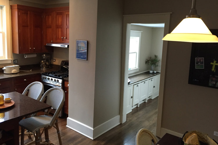
Before
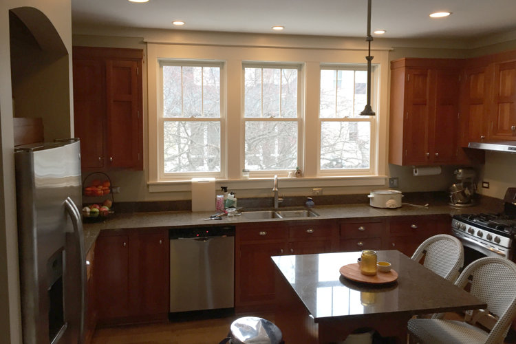
What was the client’s biggest complaint about the old design?
The kitchen was small and inefficient, the layout made it difficult to entertain, the space was dark, and they were lacking storage. There was an adjacent office that was unnecessary, and the butler pantry had unusable cabinets.
Did you have any major concerns about this renovation when you first saw the space?
None! I had walked the house a few years earlier with other clients whose biggest complaints revolved around the kitchen. When this couple bought the home, I told them I had already figured out how to redesign the kitchen and to let me know if they were interested in my pitch. We presented a new floor plan and finish selection, and they went for it.
How did you begin space planning such a large kitchen?
We started by removing a wall that separated the kitchen from the office. We took all the cabinetry off the exterior wall to get in a larger island that the client requested. There was a natural space for a dinette and four openings leading to other rooms to contend with. These things defined the final floorplan.
How did you come up with your concept for the space?
Our clients have an eclectic style, so we knew the kitchen would have to be unique. We wanted to maintain the home’s charm, but with a French bistro twist and a dash of femininity. The homeowner didn't want a white kitchen and provided us with tile inspiration which drove the flooring choice.
How did you talk your client into mixing and matching patterns?
We had a dark raspberry tweed planned for the back of the booth and because it was so simple, they agreed to the striped wallcovering. One night, I woke up around 3 a.m. and thought, “That booth seat fabric is not right for them!” I taped the floral print to the kitchen wall and told them that if they didn’t like it, I would pay to recover it. My gut said it was the way to go. Much to my surprise, the clients loved it.
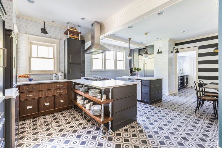
After
https://www.wayfair.com/shop-the-look/slp/439a9456--photo-id243819
How do you feel about the finished product?
I love it—I wish it was my kitchen.
Which design choice are you most proud of?
I love the open shelves. They don’t look complex, but there was a lot of back and forth that went into the custom metal pieces.
https://www.wayfair.com/shop-the-look/slp/439a9569--photo-id243816
Can you tell us about some of the sneaky storage solutions you included?
There's barely any upper cabinetry, so we squeezed extra storage in by creating toe kick drawers. The entire walnut section is a baking station; the deep base drawers house cake pans, containers of flour, sugar, etc. and the upper cabinets house the mixer.
In the butler pantry, we only had 12 inches, which we used to recess an under-counter fridge into the wall (under a staircase) and paneled it to look like cabinets. We mimicked this cabinet on the other side of the room, and between them we inserted a metal and glass liquor cabinet. This really made the butler pantry a truly functional space for entertaining.
Any takeaways from this reno?
It encouraged me to be bolder, because it was fun to create something so original. It’s easy as a designer to repeat details that work, but it’s rewarding to learn a new way of doing things and push yourself out of your comfort zone.
