Designer House Tour: Sentire Design
See how this designer used bold colors to add a fun and funky vibe to this Beverly Hills home.
Design: Sentire Design
We asked the designer of this fun, quirky space how she made it all come together. Lucky for us, Francesca Cavallin Mead, founder and principal designer of Sentire Design, didn't stop there. Keep reading to see how she transformed this Beverly Hills, Calif., home using neutrals, pops of bright color, and strategically placed wall art.
1. The house is so fun and funky! What was your inspiration?
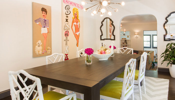
The house evokes the feel of the Parker Hotel in Palm Springs, Calif. The client admired the hotel's use of stark white walls and rich fabrics. During our first meeting, my client showed me a couple of large paintings he intended to hang in his new house. Those pieces inspired the color scheme and the mood.
2. How did you create such a beautiful balance between the bright and neutral elements?
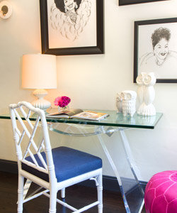
I began designing the house by creating a neutral canvas that would enhance my client's colorful artwork. White walls and ceilings contrast with the dark trim, baseboard, and floor. The original hardwood floor was lighter, but we had it stained a darker shade to complement the trims.
Design: Sentire Design
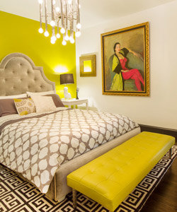
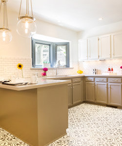
The kitchen color scheme also features white, black, and gray tones. With the exception of the bright accent wall in the master bedroom, everything is pretty much neutral. A few accessories bounce reflect the colors in the paintings and tie together the design. This balance was achieved by cautiously using colors to accent the artwork, while making sure not to overpower the room
Design: Sentire Design
3. How do you combine so many décor styles without the home seeming too wacky or off balance?
I introduce a few pieces of furniture at a time. Once I see how these pieces fit and feel in the space, I add rugs, window treatments, and lighting fixtures. Accessories always come last. I try to pick neutral tones, clean lines, and timeless design for the core, investment pieces in each room. Side tables, chairs, ottomans, benches, mirrors, and similar pieces can be more eclectic and funky. I also like to mix new and vintage items. The contrast between different décor styles makes the room come alive and keeps it interesting.
4. Was the homeowner hesitant about the color palette?
If so, how did you convince them? The homeowner had great taste and was willing
to consider ideas different from his own. He let me know he was drawn to white, grays, and pops of color. He liked solids as well as geometric patterns. I came up with a scheme that would meet his wishes, suggested a few accents, and he was thrilled.
5. We love the floor in the kitchen! What inspired the choice of patterned tile?
The color scheme throughout the entire house is muted because I needed to highlight the artwork. The kitchen was the only space where I had a bit more freedom, since no artwork was going to be displayed in there. This is why I chose to use patterned tiles. The organic motif of that particular cement tile adds a layer of sophistication to a simple and functional kitchen.
6. Can you break down your design process for us?
Listening to the clients' wishes and learning about their lifestyle is crucial to the success of a project. Later in the design process, I find myself referencing those initial notes I took when I first met my client. Often the answer is in those notes. The second part is presenting
Design: Sentire Design
the clients with a complete design scheme. Once details are defined, I finalize the design and the real work starts. The process is quite straightforward, however, interactions and exchange of opinions between my clients and I are frequent, especially in the planning phase. I find this exchange essential to the success of the project. Along with the design plan, I also keep track of the budget, so the clients can make an informed decision based on their personal taste and cost.
7. What is your favorite part of the project and why?
I particularly enjoyed designing the master bedroom. It has a very bold and distinct look. The lady depicted in the painting is Yma Sumac, a well-known Peruvian soprano whom my client knew personally. It was fascinating to hear his stories about her. This room is definitely my favorite.
8. What are your tips for someone trying to recreate the unique look of this project?
Use bold colors in moderation and have fun with your space.
9. What is your favorite designer trick?
I love to mix materials and textures. Wood and iron, glass and fabric, ceramic and cement are all stunning and unexpected combinations.
Design: Sentire Design
10. Finish the sentence: Every room needs _.
Balance. For the design to be successful, it is very important to respect the scale of the room and its architectural elements. Also, there needs to be balance between colors. If there is an accent wall, other details in the room should feature that color.
11. What is your best piece of advice for someone who wants to use bold colors and/or patterns in their home but is unsure of where to start?
Don't use that particular color/pattern on all of the walls. The best colors to enhance a bold graphic or a chromatic element are white, black, grays, and neutrals. Use one of those hues for the walls. Use your pattern or color of choice for window treatments, rugs, and pillows. Introduce colors that compliment your accent color to enhance the color scheme.
See more from Sentire Design in Shop the Look gallery.
