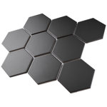
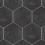
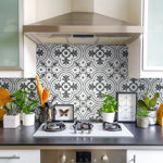
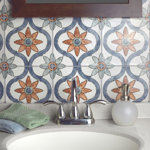
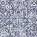
Tile is well proportioned. The printing on it is sharp. Color is like an intense charcoal or matte black. White background is not glossy, but a matte, cool white. Goes really well with any shade cabinets, and especially well with any ‘cool’ color ( off white, light gray, dark colors).
I am using it on a design job, for a historical - inspired kitchen remodel. I wanted something that leveraged early 20s design patterns ( read, large scale, dramatic black and white geometric flooring), with a modern, playful twist. This tile did the trick! Paired with shaker style cabinets, and quartz counters, this is the star of the show, in an otherwise tone-on-tone kitchen.
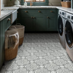
Tile is the right size for large walls or flooring, though it works great on even smaller footprint flooring. ( See my pict). I would NOT recommend it as backsplash, if all you tile is under counters, between uppers and lowers. This tile needs ‘visual space’ to work ( ie, open walls, tall walls, open shelving.)
From a design perspective, if you want the pattern to flow, you need a 18 inch spacer, NOT the thicker spacer that the ‘tile experts’ here recommend. The tile design lines are exactly 18 inch.
Many kudos to the Wayfair fulfillment and delivery teams, who did an amazing job, end to end. From order emails, to the ‘what to expect’ video, and to the great follow up from my very professional delivery team, I could not be happier.
Will update with more picts, once installed.